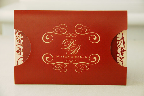
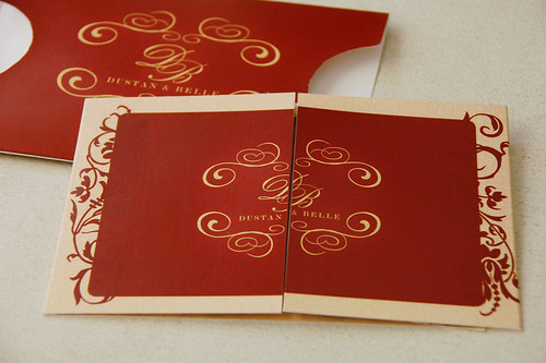
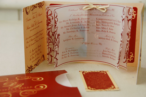
We had this quite popular style of invitation which is from Mark+Rina and also from Ned+Eunice. I believe, most of our clients find it simple and classic.
So one of our clients, an event coordinator, thought of combining the two designs. She find Mark+Rina quite big, but she liked the envelope style. On the other hand, she also liked the invitation card of Ned+Eunice.
We actually had multiple choices, three design revisions. Until finally this is what we came up with... Invitation card from Ned+Eunice and the envelope design from Mark+Rina. A smaller version with a little twist.
It's approximately 7-in wide if folded and 4-in tall, with parchment paper as inserts for the sponsors and entourage. Then we also added a photo at the back of the parchment and a gift card.
I'm thinking of a different design with a simple yet classic look for clients who prefer this kind of style. If you have any ideas, I would to hear them out too...


No comments:
Post a Comment
Thank you for reading my blog and posting a comment. I very much appreciate that... =)