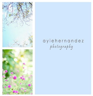
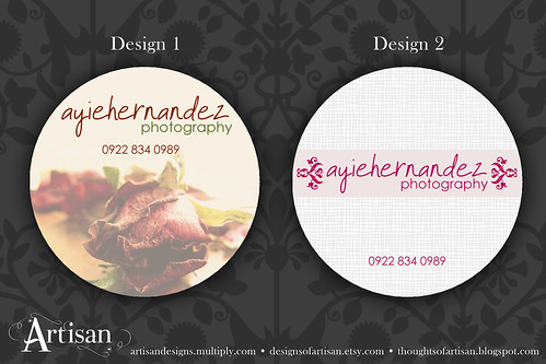
I had a privilege to design a photographer's business card. I haven't met her yet, but we have common friends. Can you believe how small the world is? Her name is Ayie and when I saw her photographs, I fell in love with 'em right away. I really admire these kind of photos, the feel of vintage and dreamy. I normally see them from the blogs I read and now I see the same style here in my own city. Which I truly feel proud for some reasons. Go check her photographs on her facebook account so you'll know what I'm talking about. But here are some of her lovely photos.
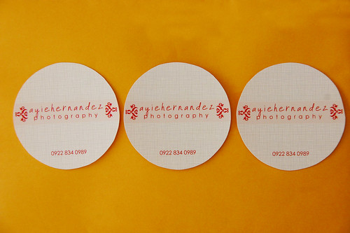
She chose Design 2 and here's the final output.
Now don't you just think these cards will make an impression? =)


No comments:
Post a Comment
Thank you for reading my blog and posting a comment. I very much appreciate that... =)