
Unlike the past 3 years, we celebrated our great years with our lovely customers with free brewed coffee. We had a StudioBooth on our 2nd year, and Bake Sale last year. However, today we just celebrated it with the crew. We ate noodles and ice cream for snacks. No fancy gimmicks, not even arranged flowers from mama, nor free coffee. It was totally a quite anniversary. But our few good friends greeted us on twitter. And that is all that matters.
No particular reason for the quite celebration though. However, I have to admit it was totally lack of preparation since I was out of the country last month and then I got so busy in the studio. Nonetheless, we are still continuing to maintain and improve more to satisfy our beloved customers. {Oooh, that sound's like an advertisement, LOL}
But don't worry loyalist and curious customers, I'm thinking of a post-celebration. We might have a give away gift card as long I was able to finalize some things.
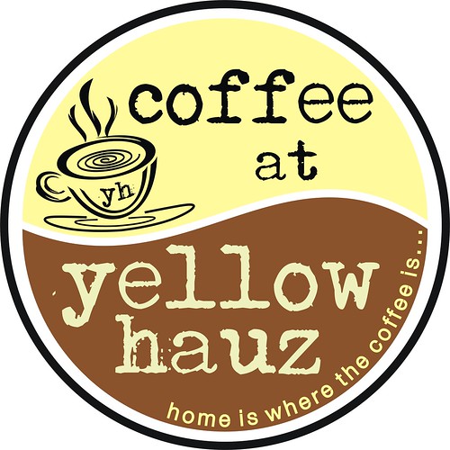
Anyway, one of my projects this year for Yellow Hauz is a change of logo. But first, let me show you our oldest to not so old designs...
Okay this one... was one of my very first designs... I was still learning the Photoshop that time {4-years ago}. This design was actually based from our architect's sample exterior layout. So, basically, I just copied it, I just looked for a better font. {Yeah, during those times, I thought those fonts were nice, LOL}.

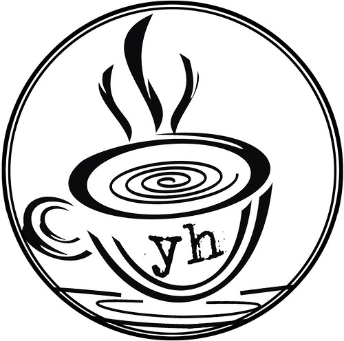
But when I met Heintje {my partner in StudioBooth, who's also my great mentor in graphic design}, he sent me an icon for my icon folders, which I liked and used it as our icon.

Then I used this one for black and white printed materials.
But this time... I'm changing it to a better one and more of my style. I also changed the icon from a coffee cup to a coffee tree. And since Yellow Hauz is an obvious name from the coffeeshop's facade, no need to elaborate on that on our logo as well. Since we had our renovation last year, we changed the interior colors to an apple green, maroon red and brown, so I incorporate those colors to our new logo.
This one is intended for our main entrance signage. Still not yet changed, but we're working on it...

And this is usually for the posters or other printed materials, or whenever I feel using it, LOL.
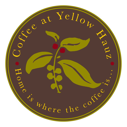
Totally different from our previous designs right? I used simple font and the color yellow to retain the "yellow" as our name says. I just love the coffee tree. Not the usual icon for coffee shop right? I realized how over-rated the cup was. So to make it unique... viola! Still related to coffee and yet a new style. Brown background symbolized the color of the wood that gives you the warmth feeling. Which our main goal when you are in Yellow Hauz. That's why our tagline is... Home is where the coffee is... it's like you're having coffee in your house.
How do find our new logo? I hope you liked it too... Soon we will change most of our printed materials and branding with this logo. We already started with our custom bottled water. Hope you'll enjoy seeing it though.
Happy 4 years of brewing coffee... thank you for accepting a home-grown coffee shop to be your second home...
I missed the noodle and ice cream celebration. huhuhuhu
ReplyDeleteYezzz... We missed you too... Bleh!
ReplyDelete