
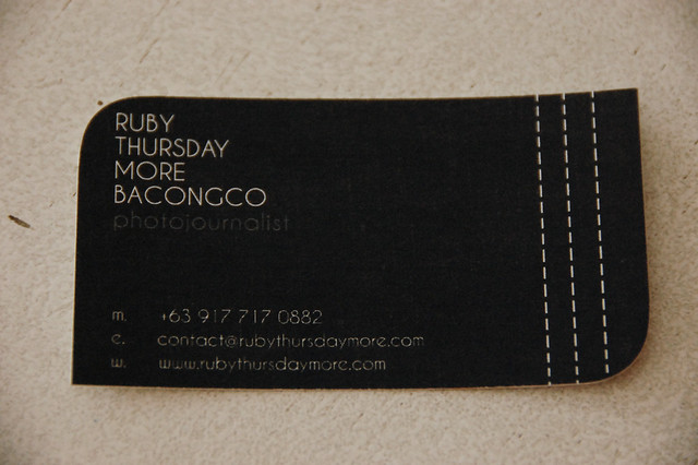
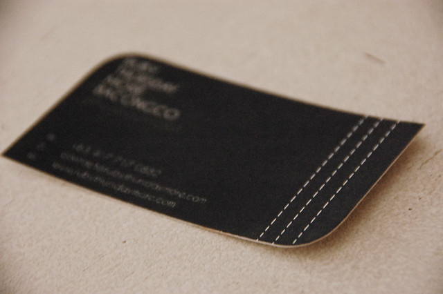
We made a calling card design for a photojournalist. I have to say, the curves on opposite edges really gave a different look for the card. We printed it on a matte paper to add some texture on the paper.
It's simple and yet it rocks! hahaha I hope whoever receives it will also notice it...
Hi April, thanks for this:-) really nice works you got there. Goodluck and GOD BLESS!:-)
ReplyDelete